In this column, we aim to improve the layout ability that is conscious of space, and the effective arrangement and expressiveness of elements.
We will look at the impressions given by composition and examples of its use from various masterpieces.
It is said that aesthetic sense is largely dependent on individual subjectivity.
However, "composition" is an objective criterion that is often used in paintings and architecture.
By incorporating the method of composition into web design, let's acquire a universal sense, shorten the time to worry about layout, and pursue efficiency!
Analysis of the three compositions featured in this article from masterpieces
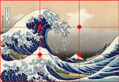
composition of thirds
"The Great Wave off Kanagawa"
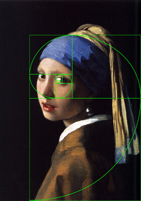
golden ratio
"Girl with a Pearl Earring"
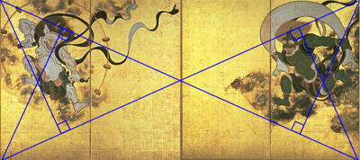
golden section
"Fujin Raijin Figure"
Pick up designs that utilize the above three compositions on the website
composition of thirds
G | Rohto Pharmaceutical: Product Information Site http://jp.rohto.com/zi/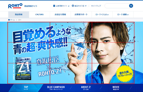
The model's eyes, large catches, and small catches are placed at the intersection of the thirds.
The layout is organized so that each element can be complicated without being unbalanced.
It is tempting to place the product images at the intersection, but by intentionally avoiding them, we are able to attract more attention in this layout.
★Points of thirds composition
Even if each element is flashy, the layout will be stable.
Since it can be used universally, it is suitable for any site, but it is also possible to emphasize it more by giving a point to be missed.
golden ratio
To the forefront of men. First premium skin care. | PGCDHOMME http://www.pgcd.jp/homme/campaign/20140707/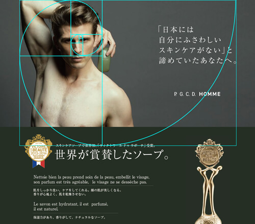
This page has boldly arranged models.
The pose, reminiscent of Michelangelo's stonework, perfectly composes the golden ratio and creates the perfect balance of space.
By adding a contrast of light and dark to emphasize the presence of the person, we were able to leave a strong impression at first glance.
*Golden ratio points
It is possible to achieve a balance between stability and dynamism.
You can leave a strong impression using models, so it is suitable for sites that promote branding.
golden section
Pocari Sweat Ion Water | Otsuka Pharmaceutical http://pocarisweat-ionwater.jp/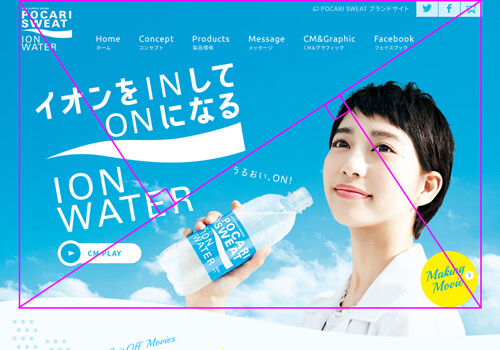
The triangles divided by the diagonal line of the outline constitute the "catch area" and the "image area".
By utilizing the composition, even the unstable elements with angles are laid out without impairing the flow of the line of sight.
*Golden section point
By separating the catch and image areas, the layout has a clear role for each element (the catch is read, the image is captivating).
It's easy to express dynamism, so it's suitable for sites that want to create liveliness.
Deployment and application to optimizers
The results of using this composition consideration in actual LP production are as follows.
Project: Business card LP
Design theme: "Stylish" "Adult"
FV section
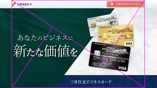
Taking advantage of the composition, I cut the screen parallel to the perpendicular line of the diagonal line.
By dividing it into two colors, it expresses the sharpness of business.
The face of the card has been placed "has" to attract attention.
By adding this "has", we are creating a "relaxed adult" look that is not too stiff.
content department
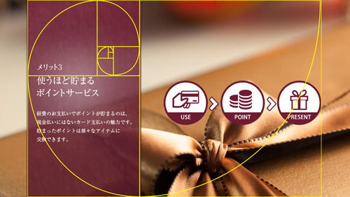
Use the golden ratio to draw vertical bands.
The width that is not too narrow and not too wide is calculated from a mathematical point of view, not "somehow". Layout is now possible with a stable balance.
summary
Research results show that what we perceive to be "beautiful" is laid out according to a mathematically derived composition.
Conversely, I thought that by laying out with that composition in mind, I would be able to create a design that more people would consider "beautiful."
If you can track changes in actions when arranging buttons and other elements according to the composition, you will be able to create even more effective sites and LPs.
reference
Practical use of golden section – Yorozuya Yukarin – Yahoo! Blog
[Summary] 15 famous arts that use the golden ratio
Related recommended pages
Building a “moving LP” landing page

Strategic website structure analysis

[calltoaction01]